Chapter 9: Design and Consistency
Quick Steps
- Stick to the site's predefined color palette (from Chapter 7).
- Use "Heading 2" and "Heading 3" for structure, not decoration.
- Keep spacing consistent between blocks.
- Use matching image aspect ratios in card grids.
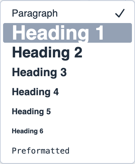
Using Headings Correctly
Headings provide structure for both search engines and screen readers: - H2: Main section titles ("Our Services", "About Us") - H3: Sub-sections ("Consulting", "Training") - Don't use H1 in content blocks—it's automatically added as the page title
Background Colors
Stick to the curated palette from Chapter 7: - Light backgrounds: Text-heavy sections - Accent colors: Section separation - Dark/High contrast: High-impact Call-to-Action bands
For details on applying background colors, see the Colors Tab section in Chapter 7.
Best Practices
- White space: Don't overcrowd. Use Padding settings to add breathing room.
- Image consistency: Use matching aspect ratios in card grids for a polished look.
- Spacing: Keep consistent spacing between blocks for professional appearance.