Chapter 5: Rows, Layout, and Sections
Quick Steps
- Add elements (Text, Card, Image, etc.) to your page.
- Set each element's column width using the Size MD dropdown directly on the element item.
- Use a Row element to group elements and optionally make that group full-width.
How Columns Work in Essentials
Columns are sized on each element
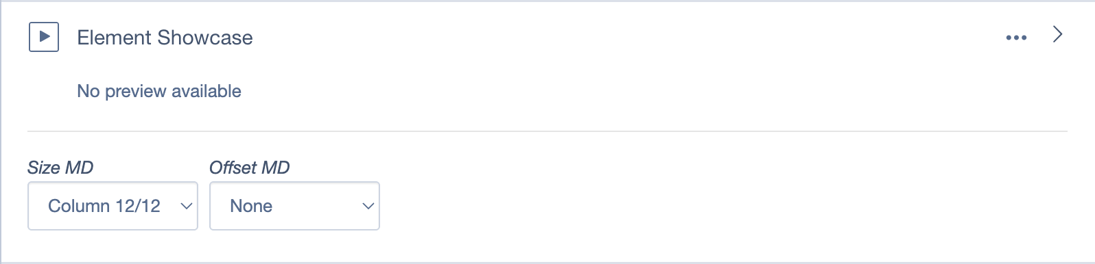
Every element has its own column controls: - Size MD (e.g., "Column 6/12" for half-width) - Offset MD (to shift the element right)
These dropdowns appear directly on the element item in the Elements list.
The grid is based on 12 units: - 12/12 = Full width (100%) - 6/12 = Half width (50%) - 4/12 = One-third width (33%) - 3/12 = One-quarter width (25%)
Example: Creating a 2-column layout
- Add two Card elements to your page.
- Set the first card's Size MD to Column 6/12.
- Set the second card's Size MD to Column 6/12.
- Both cards will now sit side-by-side.
The Size MD and Offset MD controls appear on each element, not on a row.
What Rows Are For
The Row element is a container that groups elements together.
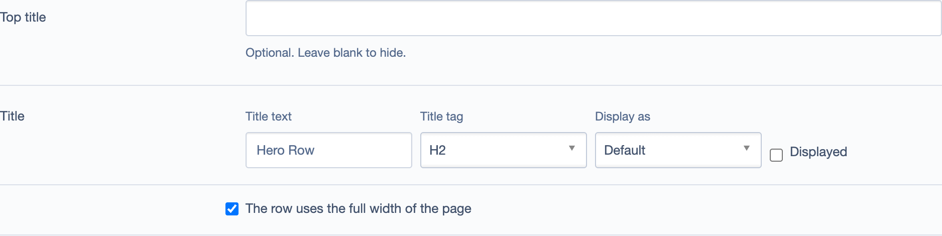
By default: - The row keeps its content in a standard page container (same width as the rest of your page).
Optional: - You can enable "The row uses the full width of the page" to make the row background extend edge-to-edge.
Rows control container vs full-width; columns are set on each element.
When to use a Row
- To group related elements together visually.
- To apply a background color or image to a section (using the row's Settings tab).
- To make a section full-width (edge-to-edge background).
Rows don't control column widths
Rows do not have settings for column widths. Each element inside (or outside) a row manages its own columns using Size MD and Offset MD.
Section Backgrounds and Spacing
Most elements have design options in their Settings tab: - Background Color: Choose from your site's theme colors. - Padding/Spacing: Add extra space above or below the element. - Rounded Corners: Adjust border radius.
Rows also have these settings, which affect the entire grouped section.
Common Layouts
Full-width hero with text overlay
- Add a Hero Media element.
- Upload a large image.
- Add your heading and call-to-action in the Content field.
Two-column text and image
- Add a Text element, set Size MD to Column 6/12.
- Add an Image element, set Size MD to Column 6/12.
- Both will sit side-by-side.
Three-card feature section
- Add three Card elements.
- Set each card's Size MD to Column 4/12.
- Optionally wrap them in a Row and enable a background color.
Tips
- Preview your changes before publishing to see how the layout looks on different screen sizes.
- Use Rows sparingly — you often don't need a row unless you want a visual grouping or full-width background.
- Check mobile — layouts will automatically stack on smaller screens, but preview to confirm readability.