Chapter 7: Design, Colors, and Custom Styles
Quick Steps
- Open an element and go to the Colors tab to set background and button colors.
- Use the Spacing tab to adjust vertical spacing (padding and margins).
- Apply Corner Rounding in the Rounding tab for softer edges.
- Check the Responsive tab for advanced breakpoint controls.
Overview
Most elements include styling tabs that let you control visual appearance without needing a developer:
- Colors - Background colors and button themes
- Spacing - Vertical padding and margins
- Rounding - Border radius for corners
- Responsive - Breakpoint-specific sizing and visibility
These options help you create visual variety and hierarchy on your pages.
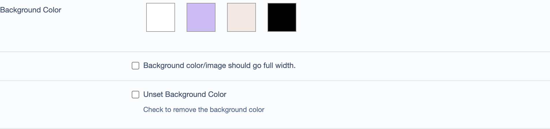
Colors Tab
The Colors tab provides a curated color palette designed for your site. Color options are pre-configured to ensure visual consistency and proper contrast.
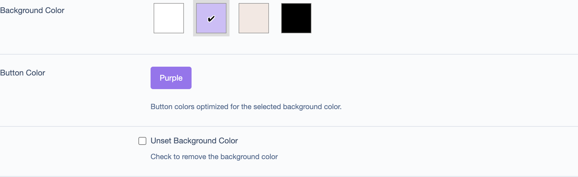
Background Colors
Background colors are displayed as visual swatches. Your site will typically have 3-5 background options designed by your creative team (for example: white, accent colors, and dark backgrounds).
Button Colors
Button color schemes change based on your selected background. Each background supports specific button options that have been tested for contrast and readability.
Button colors include hover states for interactive feedback.
Text Colors
Text colors are automatically coordinated with your background choice:
- Top title - Coordinates with button color
- Headings - High contrast with background
- Body text - Matches heading for readability
These are configured to meet accessibility standards.
How to Apply Colors
- Click on an element to edit it.
- Go to the Colors tab.
- Click a background color swatch to select it.
- Choose a button color scheme from the available options.
- Click Save.
Note: Use the "Unset Background Color" checkbox to remove a background.
Spacing Tab
The Spacing tab controls vertical spacing for elements using padding (inside spacing) and margins (outside spacing).
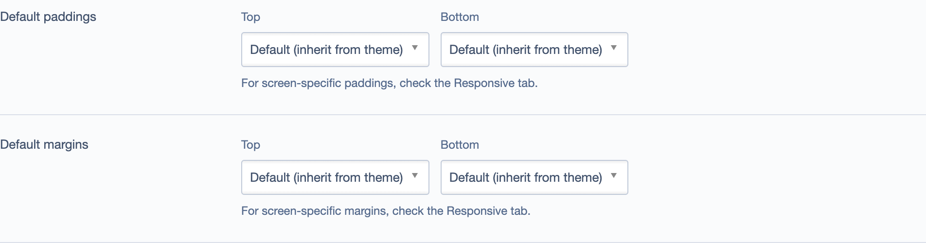
Padding (Inside Spacing)
Padding adds space above and below an element's content:
- Top Padding - Space above content
- Bottom Padding - Space below content
Common Values:
- 0 - No padding
- 1rem - Small
- 2rem - Medium
- 3rem - Large
When to Use: Padding controls vertical space within an element. Use it to: - Add breathing room between elements on your page - Create larger "hero" sections at the top of pages - Make Call-to-Action elements more prominent
Margin (Outside Spacing)
Margin creates space above or below an element, separating it from its neighbors:
- Top Margin - Space above the element
- Bottom Margin - Space below the element
Common Values:
- 0 - No margin (elements sit together)
- 1rem - Small separation
- 2rem - Medium spacing
- 3rem or more - Large visual breaks
When to Use: - Add bottom margin to create separation after an element - Use no margin when stacking elements that should feel connected - Increase margin before important sections to draw attention
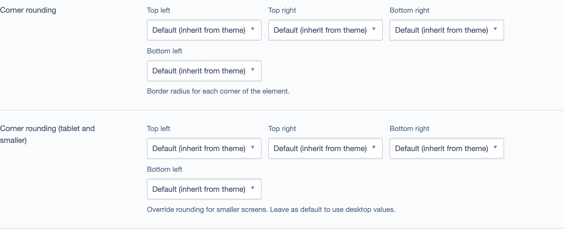
Rounding Tab
The Rounding tab controls border radius for each corner, creating softer edges.
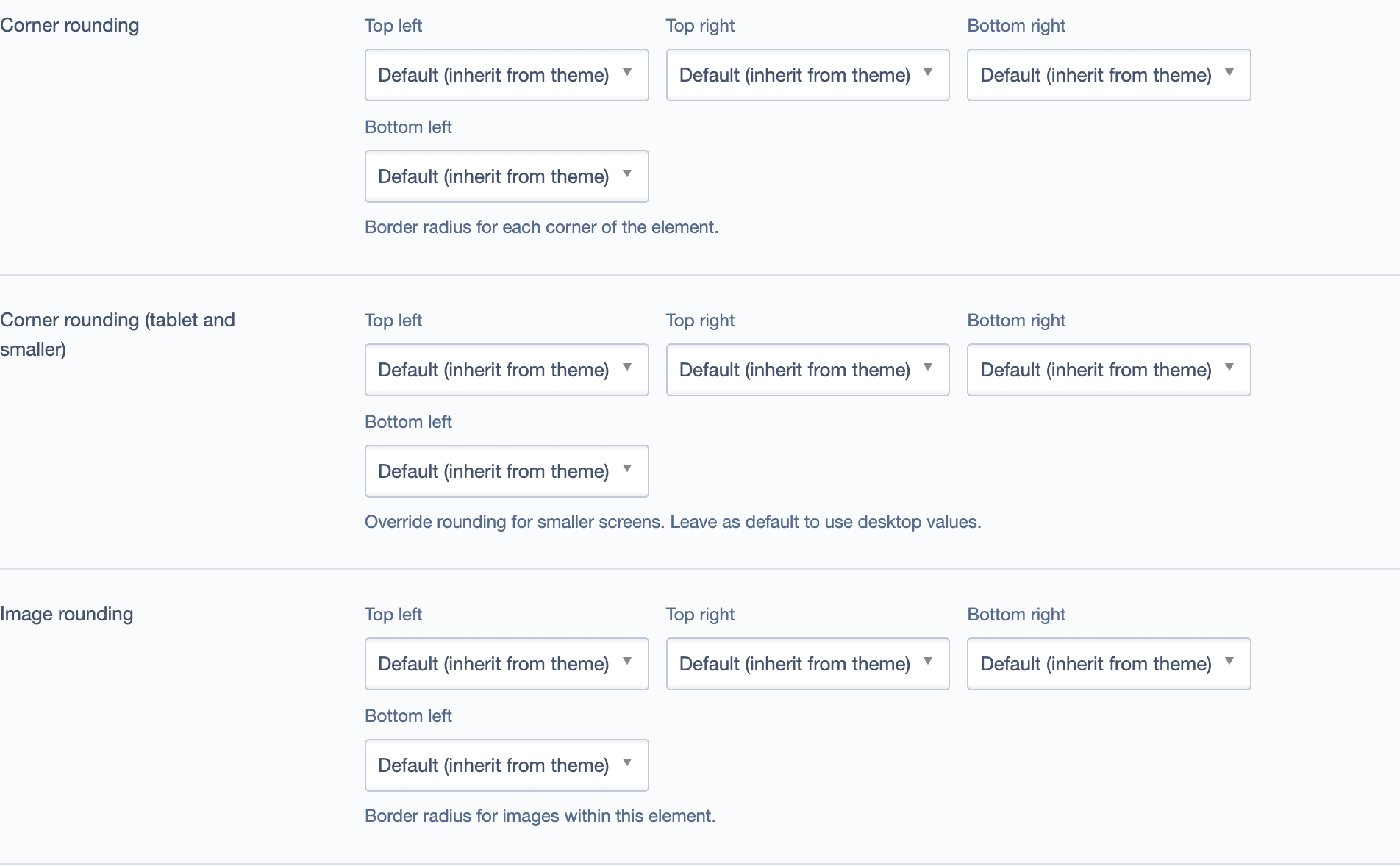
Corner Options
Control each corner independently: - Top Left / Top Right - Bottom Right / Bottom Left
Settings: - Default - Inherits from theme - None - Square corners - Small - Subtle (e.g., 0.25rem) - Medium - Noticeable (e.g., 0.5rem) - Large - Pronounced (e.g., 1rem) - Custom - Enter your own value
Responsive Rounding
Override corner rounding for tablet screens (MD breakpoint) if needed.
Where Rounding Works Best
- Cards - Modern, polished look
- Call-to-Action elements - Softens button-like elements
- Rows with backgrounds - Creates distinct sections
- Images - Softens photo edges
Design Tip: Use consistent rounding throughout your site for visual harmony.
Responsive Tab
The Responsive tab provides control over element behavior at different screen sizes.
Breakpoints
Screen size breakpoints:
- XS - Mobile phones (< 576px)
- SM - Portrait tablets (≥ 576px)
- MD - Landscape tablets (≥ 768px)
- LG - Desktops (≥ 992px)
- XL - Large desktops (≥ 1200px)
Controls per Breakpoint
Size - Column width (1/12 to 12/12) - Set how wide the element is at each screen size - Example: MD 6/12 (half-width on tablets), XS 12/12 (full-width on mobile)
Offset - Push element from left - Useful for centering or asymmetric layouts
Visibility - Show or hide element - Visible - Element displays - Hidden - Element is hidden - Use to show different content on mobile vs. desktop
Spacing Override - Adjust spacing per breakpoint - Override Top/Bottom Margin and Padding for specific screen sizes - Most elements display full width at MD and smaller, so these overrides are primarily for advanced layouts - The MD breakpoint is most commonly adjusted in the Spacing tab - Leave blank to inherit from default values
Common Responsive Patterns
Full Width Mobile, Half Desktop: - XS: 12/12 - MD: 6/12
Three Columns Desktop, Single Mobile: - XS: 12/12 - MD: 4/12
Hide on Mobile: - XS: Hidden - MD: Visible
Styling Row Elements
Row elements are useful for creating distinct sections. They support Colors, Spacing, and Rounding tabs.
Row Background Colors
Rows display background colors only (no button or text color options, as rows don't contain direct text - their child elements handle that).
Common row patterns:
Hero Section: - Background: Dark or brand color - Full width enabled - Large padding (3rem - 5rem)
Feature Section: - Background: Light accent - Container width - Medium padding (2rem)
Content Separator: - Background: Neutral color - Medium padding - No rounding for seamless flow
Row Spacing

Use padding to create visual rhythm: - Large padding (3rem+) for hero sections - Medium padding (2rem) for feature sections - Bottom margin to separate major sections
Row Rounding
Apply corner rounding to rows with background colors for a distinct "contained section" look.
Common Style Combinations
Card Feature Section
- Colors: Light accent background
- Spacing: 2rem top/bottom padding
- Rounding: Medium corners
- Responsive: MD 4/12 (three across), XS 12/12 (stack on mobile)
Hero Row
- Colors: Dark background
- Spacing: 5rem top/bottom padding
- Rounding: None or Small
- Content Tab: Full width enabled
Call-to-Action Row
- Colors: Bright accent background
- Spacing: 4rem padding
- Rounding: Large corners
- Content Tab: Container width
Best Practices
Consistency
- Use 3-4 background colors maximum across your site
- Apply the same corner rounding to similar elements
- Establish standard spacing values (e.g., 2rem for sections, 3rem for major sections)
Visual Hierarchy
- Use darker backgrounds or larger padding for important sections
- Use subtle backgrounds to group related content
- Use margin to create breaks between major sections
Testing
Before publishing: 1. Preview on desktop, tablet, and mobile breakpoints 2. Check text readability on all backgrounds 3. Verify spacing looks consistent 4. Test at 150% and 200% browser zoom
Troubleshooting
Styles aren't showing: - Click Save after making changes - Refresh Preview mode (caching can delay updates) - Verify you're editing the correct element
Spacing doesn't match between breakpoints:
- Check responsive spacing overrides in the Responsive tab
- Empty values inherit from larger breakpoints
- Set to 0 to explicitly remove spacing
Rounded corners look cut off: - Reduce the rounding value - Ensure the element has padding if it has a background
Element hidden on wrong screen: - Check Visibility in the Responsive tab for each breakpoint - Test on actual devices, not just resized browser windows