Chapter 4: Building with Elements
Pages in Essentials are built from Elements (sometimes called “blocks”).
Instead of editing one giant text field, you add small, purpose-built content pieces (text, media, accordions, cards, etc.) and arrange them in the order you want.
Fast path (recommended)
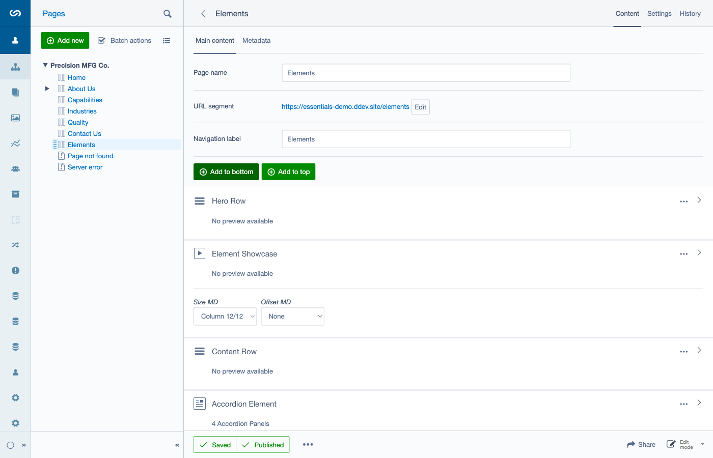
- In the CMS, go to Pages and open the page you want.
- On the Content tab, scroll to the Elements list.
- Click Add to bottom (or Add to top) and pick an element type.
- Click an element’s title to edit it.
- Drag elements to reorder.
- Save / Publish the page when you’re done.
Where Elements live on a page
On most pages, you’ll find the main Element list inside the page edit form.
You’ll usually see buttons like Add to bottom and Add to top above the list.
Adding elements (Add to top / Add to bottom)
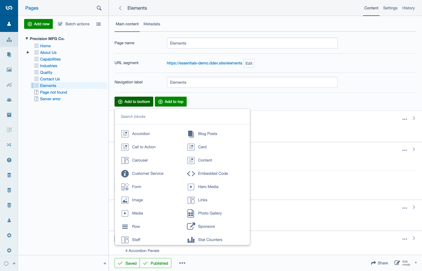
The Add to top and Add to bottom buttons open the element selector.
- Add to top inserts the new element at the top of the list.
- Add to bottom inserts the new element at the bottom of the list.
You can always rearrange later, so don’t stress about “perfect placement” the first time.
Reordering elements
Elements can be rearranged using drag-and-drop.
Tips: - Move elements in small steps if the list is long. - Re-check on the front-end preview after big changes.
Editing an element
In the Elements list, each item can be edited.
Common patterns you’ll see: - Click the element’s title to open its edit view. - Some elements can show editable fields inline (a “Show editable fields” control). - Many elements have additional design/utility tabs (for example: Colors, Spacing, Rounding, Settings, Responsive). These affect presentation, not the core content.
When you’re finished editing an element, use Save or Save and Close.
Layout controls: Rows vs Columns (important!)
Key concepts: - Columns are set on each individual element using Size MD and Offset MD dropdowns. - Rows are container elements used to group content and optionally create full-width sections.
For detailed instructions on creating multi-column layouts and working with rows, see Chapter 5: Rows, Layout, and Sections.
Installed element types (as named in the CMS)
These are the element types available in the Essentials demo CMS:
- Accordion
- Blog Posts
- Call to Action
- Card
- Carousel
- Customer Service
- Embedded Code
- Form
- Hero Media
- Image
- Links
- Media
- Photo Gallery
- Row
- Sponsors
- Staff
- Stat Counters
- Testimonials
- Text
- Virtual
The sections below explain what each does, what fields you’ll be asked for, and common editor tips.
Element guide (what it’s for + what you fill in)
Accordion
Best for: FAQs, policies, “common questions”, collapsible details.
What you’ll fill in: - Intro (optional): short text above the accordion. - Panels: a list of accordion panels you can add and reorder.
Each panel typically includes: - Title (+ a “Displayed” toggle) - Image (optional) - Link (optional) - Content
Editor tips: - Keep panel titles short (scan-friendly). - Don’t hide essential info behind too many panels.
Blog Posts
Best for: showing the latest posts (or a category) on a landing page.
What you’ll fill in: - Featured Blog (optional) - Category (optional; depends on Featured Blog) - Posts to show - Content (optional intro)
Editor tips: - If you don’t pick a blog, it will fall back to latest posts.
Call to Action
Best for: a prominent “next step” band (request a quote, book a call, download something).
What you’ll fill in: - Content (the CTA text) - CTA Link (button/link destination)
Editor tips: - Use one clear action. - Avoid multiple competing links inside the CTA.
Card
Best for: feature/service callouts (often used in a multi-column layout).
What you’ll fill in: - Title - Description - Image - Image Position (Left / Right / Top) - Link (optional)
Editor tips: - For a 3-up layout, set each card’s column size so they sit side-by-side.
Carousel
Best for: rotating highlights (use sparingly; make sure it remains readable).
What you’ll fill in: - Content (optional intro) - Slides (add/reorder slides) - Carousel Settings (in the element’s Settings area)
Editor tips: - Keep slide text short. - Confirm it works on mobile (swipe, readability).
Customer Service
Best for: showing a contact block for a location/department.
What you’ll fill in: - Location Name - Website (optional) - Phone - Email - Fax (optional) - Content (optional)
Embedded Code
Best for: iframes, widgets, third-party embeds that require paste-in code.
What you’ll fill in: - Embed Code (the HTML/JS snippet) - Content (optional)
Editor tips: - Only embed code from trusted sources. - If something breaks layout, remove the embed first and re-check the page.
Form
Best for: contact forms, enquiry forms, newsletter signup.
What you’ll fill in: - Form fields and settings (add fields, configure recipients, etc.)
Editor tips: - Test the form end-to-end after changes (submit a test entry).
Hero Media
Best for: a strong page header/hero with an image or video.
What you’ll fill in: - Type: Image / Video / External video - Image (main) - Image Mobile (optional) - Video (upload) or Video URL (external) - Autoplay video (external video) - Cinematic (video styles) - Content (optional text overlay)
Editor tips: - Provide a good-quality image even for video (poster/fallback).
Image
Best for: a single image element.
What you’ll fill in: - Image (one upload/selection)
Links
Best for: a list of helpful links (downloads, related pages, resources).
What you’ll fill in: - Content (optional intro) - Links list (add/reorder)
Media
Best for: embedding a video from YouTube/Vimeo (or other supported services).
What you’ll fill in: - Embed video (paste the URL) - Content (optional)
Photo Gallery
Best for: multiple images displayed as a gallery.
What you’ll fill in: - Intro (optional) - Images list (add/reorder; bulk upload may be available)
Row
Best for: grouping elements together and choosing whether that group is container width or full width.
What you’ll fill in: - The row uses the full width of the page (toggle) - Optional “custom classes” fields (advanced; usually leave blank)
Editor tips: - Rows don’t define columns for child elements; set column widths on each element.
Sponsors
Best for: showcasing sponsor logos.
What you’ll fill in: - Number of sponsors to show (0 = all) - Sponsors selection list - Content (optional)
Staff
Best for: showcasing team members.
What you’ll fill in: - Content (optional intro) - Staff list (select existing staff entries and order them)
Where the data comes from: - Staff members are managed in the CMS under Staff.
Stat Counters
Best for: “numbers that build trust” (years in business, parts shipped, etc.).
What you’ll fill in: - Content (optional intro) - Stats list (add/reorder)
Each stat typically includes: - Label (e.g. “+”) + number + title - A “stat type” setting that controls formatting
Testimonials
Best for: rotating or curated social proof.
What you’ll fill in: - Number of testimonials to show - Categories (optional filter) - Content (optional intro)
Where the data comes from: - Testimonials are managed in the CMS under Testimonials.
Text
Best for: a straightforward text block.
What you’ll fill in: - Content (rich text)
Notes: - This is similar to Content, but is presented as Text in the CMS.
Virtual
Best for: reusing an existing element in multiple places (advanced).
What you’ll fill in: - Choose the Linked element (the “original” element to reuse)
Important: - If the original element isn’t published, the Virtual element won’t work on the live site until the original is published.
Removing an element
To remove an element from a page, use the element’s actions menu and Archive it.
If you remove something by mistake, check the page’s History/versions (Chapter 3) or ask an admin to help restore it.